Dunny Artists Talk 2Tone
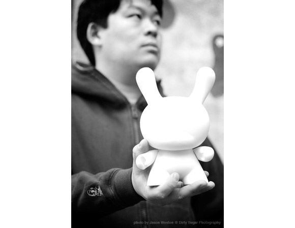
With all the buzz around the new 2Tone Dunny Series, we asked the artists, “What do you like about working with white and black?” Here’s what they had to say…
Pon
WHT: I like white because it is not really a color at all, and storm troopers look awesome in it.
BLK: I like black because it is the color of my soul, and Darth Vader looks equally as awesome in it.
______________________________________________________________________________________
Aya Kakeda
WHT/BLK: They are Onigiri colors, my favorite food. White rice and a black seaweed makes my stomach grrrrr.
______________________________________________________________________________________
mcbess
WHT: I like white because, next to black, it’s the most contrasted union in the world.
BLK: I like black because, next to white, it’s almost as contrasted as white to black. It’s the second most contrasted union in the world.
______________________________________________________________________________________
Steve Harrington
WHT: I like white because it needs color in order to exist.
BLK: I like black because it covers color so well.
______________________________________________________________________________________
Arron Meshon
WHT: I like white because it is the best background color that truly compliments our black French Bulldog, Chubu in his many photo-shoots.
BLK: I like black because it is the color of Chubu, our French Bulldog.
______________________________________________________________________________________
Tad Carpenter
WHT: I love white because it is the color that a lot of times just tops off a final design or illustration. Adding highlights or final details has to be white. It always seems to bring the most impact – not to mention all the great stuff out there that is white…. like white rabbits, white blood cells, white elephant, white russians, white bread and of course, Barry and Bettie White.
BLK: Black is one of those colors that just screams strength. You add a substantial amount of black to any illustration or design and the black can carry and hold the piece together, like a frame. Not many colors can do this. Black is a color that has so much goodness like black licorice, black cats, the Black Mamba, black magic, black holes and of course, Jack and Lewis Black.
______________________________________________________________________________________
Angry Woebots
WHT: White is so virgin it sticks out. It’s plain and it needs color. It’s an intro ready to be messed with. It’s too perfect and nothing is – it’s there to be tainted. If you add a color over it, it stands out brighter then its foundation.
BLK: Black can cancel out color. It’s the base coat of a ninja and keeps a badass look to what ever it covers. It hides the dirt beneath the surface. Just like the animals I paint, they may look cute outside the fur… but try and hug a live Panda Bear. They will tear you apart with no facial expressions.
______________________________________________________________________________________
Doktor A
WHT: It makes black look so dark.
BLK: It makes white look so bright.
______________________________________________________________________________________
Huck Gee
WHT: It’s JDM yo!
BLK: I never have to waste energy deliberating over my wardrobe.
______________________________________________________________________________________
Chuckboy
WHT: i like white because it’s sterile, futuristic, simple and sophisticated. it’s also the color of my underwear.
BLK: i like black because it’s sexy, dangerous, designer and universal. and, HELLO, it like, goes with everything?
The post Dunny Artists Talk 2Tone appeared first on Kidrobot Blog.









Leave a comment